Category: Net Art

Ink Jet Printer Print Remixing in the Studio

Ink Jet Printer Print Remixing in the Studio

Well, its April now..

Been at it again.. those tensions between wanting to make more digital art work versus making more analog based art work. Its weird to use the word “analog” instead of “applied” but I guess they are really similar. Allow me to elaborate. I always want to learn. Its an obsession and an addiction. Its a good addiction though, and the word addiction is probably over used in this context. I became aware that computers were a tool for making art as far back as 1986. The fact that I could learn to write a simple program that would visually display the action of repetition was all I needed to know, really. Well, and to see as well to understand “how” this new tool would help and forever change the way that art can be made and communicated. The word repetition is one of my favorite “principles” of art and design. The process of repetition can easily be displayed as a pattern, or a series of patterns, just like physical actions and behaviors can be observed and recorded as patterns. MEMEs are also patterns and have roots in psychology and behavior. So, do a little bit of math in your head and think about how this example effects you? Repetition in behavior eventually equates to practice. Sometimes this “practice” is totally intentional and we do it with awareness and other times, well, we unconsciously engage into the unconscious practice of behaviors that also equal patterns that may not be great for us.. but what about process based patterns of techniques?


The image above is a constructive, addition based relief sculpture made from found and recycled wood scraps. Each piece was found, accumulated, saved and later arranged into this composition (wood glue held it together at the time.) The image is taken from a bird’s eye view to help give the impression that the piece is flat (the bird’s eye view is me standing on the table with the camera.) The photo itself creates the overall two-dimensional impression.. (the actual sculpture has been dismantled and released back into the ongoing scrap bin graveyard of an ex-sculptors memories…) as I write this, I find it curious that I mainly documented the piece in this way. What did I for-see or know about this pieces legacy back then subconsciously? This is an image of the completed sculpture on the wood-shop studio table, before it was exhibited a few weeks later.


The actual sculpture was created in 2014, exhibited 1 time in public and then stored in my studio along with a few other similar works. OK, I actually made a ton of pieces in this similar process, style and technique, Ill dig them up soon again, and if you know my work, you can see where the latest paper sculptures come from. Lets face it, light and lighting plays a big role in the capture of images, and in this case, both images are not great examples of the sculpture in good light. But the placement and displacement of the piece hopefully helps the viewer to see some of the potential of where the idea evolved to and from. The piece looks very different against a plain white wall with a light source applied to it.


I rediscovered the 1st image recently (because I finally zipped, exported and downloaded my entire tumblr archives.. 3.9 Gigs worth..) and opened it in adobe photoshop. I got excited. I used the pen tool to create a series of paths that traced around the outside contour line of the sculpture’s form and image as a whole. I converted the paths into a selection and copied it and pasted it back into the original image as it own layer. I scaled it down by 60% and rotated the image 45 degrees counter clockwise. Wallah! This is the outcome above. I suppose it was the tinkering with this image that helped me see the potential of how I could extend my experiments with this piece, which now had become completely not only two-dimensional but also existing purely as a very flat digital file. The image above activated the energy, I knew I must take further action!


Above, the 2021 outcome! Well, #1 for now – I got really curious and began to see the potential of another tool, my old friend, the ink-jet printer! I dusted it off, thanked it for its trusted service and loaded it up with some glossy paper and began printing out the form that I cut out and re-mixed into the first image. I cut the image up into fragments and pieces of different scales and covered each piece with clear packing tape. I also left a stroke of white to contour each piece that I cut out, I think it helps! The tape, this was just in case I wanted to plant a few up in the street here in my neighborhood, which is always fun to do. The tape helps protect it for a while from the elements.. and also keep its form in tact. Plus, it gives the image the appearance of a sticker or decal. I made this arrangement above. The piece has some gauge too, it pops off of the surface of the wall at about 2.5 inches. The entire thing is adhered with thick gorilla duct tape on each piece. Duct tape is very temperature sensitive so when the temp in the room changes, things will shift and move a bit. I like how that fuses together with the fact that each piece is just printed paper with clear tape over it. The seemingly “cheap” medium tricks the eye into thinking this is something much more like wood, does it not?


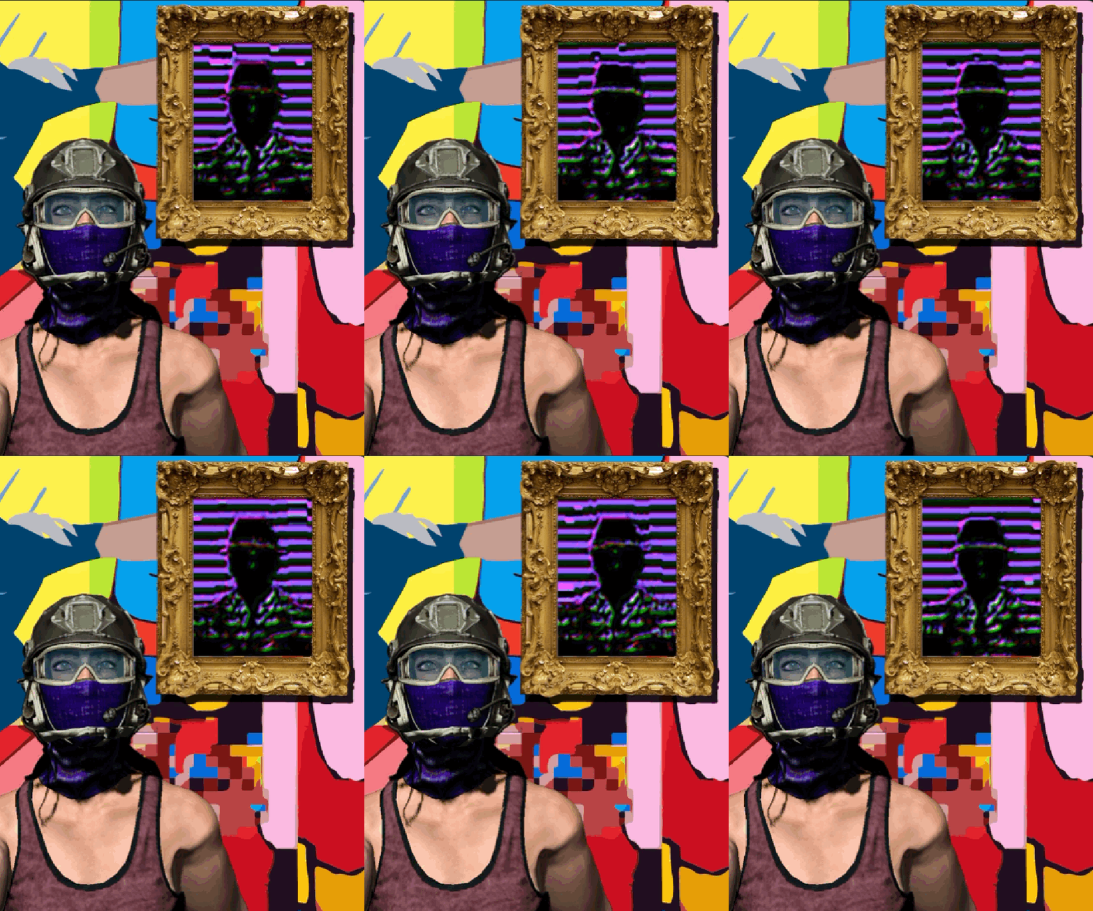
Above you can see how the piece integrates itself into a few other works on my studio wall. The piece to the left is a figurative arrangement made in a similar way using bristol paper and duct tape and the portrait is a digital manipulation made from some data-bending techniques (that portrait image also has a layer of clear transparent packing tape on it.) I think that the clear tape actually adds another layer of saturation to the printed image. I think this picture helps give an impression of the overall scale of things too. Perhaps these pieces all kind of work well together too..?


This is a larger detail of the data-bent portrait. It contains several layers that have been manipulated in photoshop. I feel that it looks OK as a digital image on screen, but there is just something so nice about the over saturation feel of the ink jet print quality that just seems to help the overall aesthetic of this. Of course I am biased as the creator of it.. haha. Will this piece make the NFT cut? Perhaps? Lets see what it led to below.


The image above follows the same idea as the wood piece up at the top of this post. This is also an ink-jet print out that I cut up into fragments and covered in clear packing tape. I used loops of duct tape to hold the pieces and parts together onto the wall. It helps that wall is also made of painted brick and that its pretty old.. vintage aesthetics man.. When I first made this piece I felt that it was really missing something and or was just too busy for the eye to follow, but my IG peeps seemed to love it and also supported the piece as it was, and I don’t mind being wrong at all! I love it now, and its good to share where the original came from as this piece was purely digital at the start, made in 2017 and never printed or displayed off of a “screen”. See below.


The moral of this story, there is definitely a lot of value still in print, remixing and reviving older works. We have repositories of images from our own work.. Especially for works that are purely digital and for works that are purely applied. Seeing the work in the opposite context creates a good tension that will usually result in the making of new work! The work may surprise you more than you think! OK, so now Im off to make some 3D models of these for Virtual Reality :))))

The Word “Break” is in “Spring-Break”..

The Word “Break” is in “Spring-Break” – March 2021

Its been a heck of a year.. here we are 1 year later from when the Covid-19 pandemic caused mass lock downs here in NYC and far far far beyond. Im not yet writing this from a “post” Covid reality.. but it is late March 2021 and Spring Break has arrived across many academic calendars for the next 2-3 weeks.

Here is a friendly reminder for those in the teaching profession and beyond, take a good read and please let me know if you need me to help you in your AWAKENING…


  1. Fellow teaching colleagues, some of you really need to hear this – what example(s) do you think that you are setting when you overload your students with hefty assignments that “need” to be completed over their spring break?


  1. When this is promoted and expected, it is all about you. EGO. It says that you are not mindful and considerate of others, especially your students and what that time may mean to them, as well as take away from them.


  1. It also tells the student that taking a break is not important even when it is clearly scheduled to happen. I’m not talking about the suggesting of “inspiring-ness” to check out if they wish to, but ridiculous deadlines and expectations during that time.


  1. The word “break” is in “Spring Break” – as in; take a break away from the repetitive actions, commitments and deadlines that have occurred consistently over the last 8 weeks.


  1. Here is the mantra; compassion, empathy, patience, understanding. There is no EGO in teaching. Let’s all take a break.

Studio Musings & the Digital Versus the Analog!

Studio Musings & the Digital Versus the Analog – 2021, Studio Shot

Tensions are running high here at the Brooklyn studio again.. Im torn between the analog and digital, the “next new” and the “past nostalgia”! They say; “Reflect, Reflect You Must” and we do, and we default to the voice of Yoda, gladly, but then again, we must transcend, and we must go forward, we must go meta-forward! 

These are a few current experiments above and below, they are living together, side by side, getting to see each other’s perspective. They need each other, very much.

Change can happen faster when we face our own metaphors, I like the vulnerability!


Xeroxed (A Metaphoric Looping Confrontation) The Explanation Post

digital photocopies, on loop as an animated GIF

Xeroxed, (A Metaphoric Looping Confrontation..) The Explanation Post

2020, animated GIF, blog post excerpt, full browser page GIF and video embed.

Welcome back, if you previously had an intervention with this blog post then you know that it will have rolled you to a full screen version of the animation looping in the browser window. All that the unsuspecting viewer was able to see was a “preview” of the blog post that appears in the blog roll section of the home page, or on the blog page itself. The preview of the post was hopefully engaging enough to lure you in. If you clicked on the preview it would redirect to the actual information in the post, but that never happens, you are taken directly to the looping action itself. A forever looping Xerox photo copy of a blank page…

(PS – you can revisit that simulation hereClick Here <– or Below to View the full Web Browser Page Variation of Xeroxed)

Lets talk context. A photocopy machine produces an endless series of copies.. Our brain responds to several aspects of what we see. It is enough information for us to reflect upon having the experience before… When the ink toner begins to run low it starts to produce degenerated copies. This effects the image and the ability to communicate its message(s).

This animated piece of Internet / Web Browser codependent art is digital and paperless. It is a paperless looping series of repetition to activate your self awareness…. ah the metaphors… a metaphor and an indicator of behaviors. What loops are you facing in your life that you walk right into over and over producing the same results.. the results that get a bit more degenerated each time we become aware that we are in the loop? Below is a screen shot from the previous “page” which is actually a page. I used a snippet of CSS using the page ID # to redirect the URL once the preview of the post in disguise was clicked on – the code is below.

.page-id-20721 #main-header { display:none; }
.page-id-20721 #page-container {
padding-top:0px !important}

Your Assignment: Create a visual metaphor that applies the idea of “redirection” as a concept that can function as a static or looping image to extend its meaning. The final outcome must be shared via an active URL.


Linear Expansions, A Continuum of Line & Form

“Linear Expansions, A Continuum of Line & Form”, 2021, Work in Progress, A Cut Paper Wall Relief.

Im excited to share the progress and process of this new series of paper cut-outs. The forms are arranged directly onto the brick wall in my studio and live there as the piece builds a little more each day. 

Everything starts out as a drawing in my world.. mostly. I suppose thats because its where I got started with art making. Above, we see just a series of smooth and gestural intuitive lines. Im always both surprised and excited by the infinite outcome of what the lines will do. I never draw the exact same character twice. There is always another iteration to explore and become surprised by. The paper cut out at the top of this post is in progress and has thoroughly been inspired by this series of drawings created last week. I cut them out and arranged them on my wall to create a “narrative”. This also serves as an example for my Illustration & Design students this semester. I hope they like it!


The drawings above are a result of this process in the video above. I finally started sharing some of these videos on social media… These kinds of drawings happen in immediacy. Fast, intuitive lines that form each character. They are all different yet unified by their stylized lines. But why stop there, I began to think about process and creating gauge and layers. What happens if I cut some of these forms out? And so it went..

It all starts out like this. Start to extract the drawing by flattening it into fragments. Im using a think bristol paper as my paper source. (Strathmore) the surface is smooth a durable. But alas, it is paper and paper is temperature sensitive, so over time it does buckle and curl. I find that this actually helps though, see the process below

(Sorry for the blurry pict above -Ill reshoot this!) I then lay out a flat variation of my cut out forms in layers, very much as one would use layers when using adobe photoshop or illustrator. This is the analog version, and it is a lot of fun to do. The application onto a flat surface is next. Im working kind of large on this piece to see how the scale holds up, I will make a few small pieces too. 

Here is the first character that was applied to the wall. The forms are adhered to the wall using several loops of thick gorilla brand duct tape. The duct tape works well because it can be “stacked” and it is strong enough to hold the weight of the paper as I layer it. Keep this in mind as the further that your pieces layer and come off of the surface of the wall, they may begin to show the effects of gravity :)) – the process continues!

Process – Here is the progress with the second character created and applied to the wall.

Here you can see the beginning of the third character as well as the reference drawings before they were moved to make room for the next characters.

I work a little bit each day. I enjoy the process so much so I tend to work slow to savor the journey. I also enjoy sitting back and looking at the piece as it grows as it gives me a lot of new ideas. Of course, the next adventure will be to make the characters free standing and able to support themselves in the round. 3D is inevitable both as a physical sculpture and a 3D model in a digital space. 

As of today, 2/17/21 this is where Im at in terms of progress. Should I add more smaller pieces and fragments as scale contrasting details? What am I missing? Lets hear some feedback!

Note – YES, I plan to work in this style with other more permanent materials. I would love to see a series of these placed into public space, would be sweet to see a series inside the nyc subway stations 🙂