Tag: ryan seslow

How to Create Paper Cut-Out Art: Tips & Techniques for Beginners

Back again with another lil’ series of 2D wall relief paper cut-out forms. Both of the pieces below follow the same process and technique. Im really happy with the process and outcomes. Im working on animating them as we speak. I’ll add them to this post later, so be sure to check back! My paintings inspire my drawings, and my drawings are inspired by those same forms found in my paintings. It makes sense that every so often I want to make those forms “pop out” and off the surface of a flat plane. Alas, it all starts with a quick sketch. See below, just a series of light loose free flowing lines take the lead, forward ->

Here we have a dude posing for a profile style portrait. Most likely, this is inspired by the NYC B-Boys from the years 1983 – 87ish. Either way, it’s nostalgia for me. Once the sketch feels good, I’ll break out the paper and x-acto knife. I keep telling myself that one day Ill work with another material other than paper for these works, perhaps wood or metal.. It will happen, I can foresee it for sure, hang in there. Im using a white bristol paper for the cut outs, I believe is the vellum type and not the glossy, but either or will work just fine. I love to cut paper and the whole medium of paper art in general.

Paper cut-outs, also known as paper cutting or Kirigami, is a traditional art form that involves cutting shapes and designs out of paper. The history of paper cutting can be traced back to ancient China and Japan, where it was practiced as a folk art. The Chinese and Japanese would create intricate designs, often featuring animals, plants, and mythical creatures, and use them as decorations for festivals and special occasions.

Using the sketch above, I apply the “map” of the shapes and forms that I see. Sometimes I redraw those forms on the paper that I will cut out, and sometimes I just “draw” with the x-acto knife to recreate the forms. Sometimes, it’s a combination of both of those techniques. There is also a series of “out-take / byproduct” cut outs that do not make the final piece, those can be saved and used for the next piece, obviously!

More history, for context – the art of paper cutting spread to other parts of Asia, including Korea, where it evolved into unique styles and techniques. In Japan, for example, paper cutting was used to create delicate and intricate designs for paper lanterns and screens. In Europe, paper cutting was popularized during the Renaissance and was often used to create elaborate decorative patterns for books and other printed materials. Check the bottom of this post for a list of other artists that work with the medium.
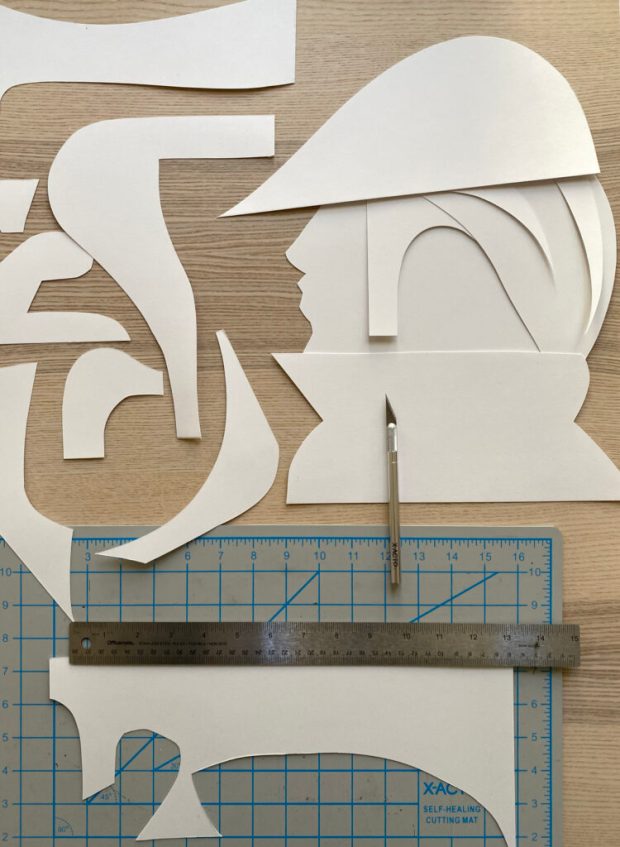
I layer the forms on top of each other to compose the arrangement as a whole, its fun to watch it all come together, in the next phase, you will need some kind of durable tape or you can make little paper forms that can be pasted to both sides of the forms as they stack, this will create the gauge and depth of the piece once it is placed onto the wall.

This is the final composition above, I love it! I used a roll of duct tape to make small cylinder forms that connect the pieces together, the piece as a whole comes “off of the surface of the wall” by about 1.5 – 2″ inches – you can play with this a bit but keep in mind, the tape makes the piece heavier and it will want to comply with gravity 🙂

I hung the piece (also temporarily adhered via the same duct tape) for the photoshoot and to also get a good look at how it will function on the wall. I have an old painted fire place in my studio that is a great surface for hanging things, I love the contrast of textures between the bricks and the paper, as you know, the shadows will be super cool to see too.

Once I had the whole piece constructed I took a few pictures of it. I immediately wanted a clean vector line drawing of the whole character. I brought the photo into adobe Fresco and used a vector brush to draw this lovely variation. This is how my brain works, I switch paths because I know they are really pipelines to the “next thing” that I will push this to, so forward we go. I can see this potentially becoming a new logo for an aspect of my design biz, or at least a new t-shirt in the classic newyawk series

Then, it was light source and photo shoot time. Im not really happy with these picture as traditional “photographs” as I know I can do a much better job, but, as a series of “sketches” for a planned photo shoot, these will really help to make those plans a reality. I love neon colored lights. I have a bunch of them from various places and spaces that I found on the internet. Amazon has a great selection of flashlights with various colored light options. Get a few and play around with how the light can effect your work and the shadows that it creates. This is where the depth and gauge of your pieces play a role. The photos below are also a part of the same session, which all took place over a few days. What do you think? Shall I make more?

In the 20th century, paper cutting experienced a resurgence in popularity as an art form in its own right. Notable artists who have contributed to the art of paper cutting include:

  1. Béatrice Coron: A French artist who has created intricate and expansive paper cut-out installations for public spaces and galleries around the world.
  2. Yoo Hyun-mi: A South Korean artist who creates paper cut-outs that explore themes of identity and cultural heritage.
  3. Hina Aoyama: A Japanese artist known for her intricate paper cut-outs of animals and natural landscapes.
  4. Elsa Mora: A Cuban-American artist who creates whimsical paper cut-outs that often feature fantastical creatures and characters.
  5. Hunt Slonem: An American artist known for his large-scale paper cut-outs of birds and butterflies.
  6. Xiyadie: A Chinese artist who creates intricate paper cut-outs of traditional Chinese motifs and landscapes.
  7. Hari and Deepti: An Indian artist duo who create mesmerizing paper cut-out scenes using layers of intricately cut paper.
  8. Karen Bit Vejle: A Danish artist known for her intricate paper cut-outs that often feature patterns inspired by nature.
  9. Nikki McClure: An American artist who creates minimalist paper cut-outs that often explore themes of motherhood and nature.
  10. Wu Jian’an: A Chinese artist who creates paper cut-outs inspired by traditional Chinese art and mythology.


Welp, if you got this far, many thanks! Much more to come!

Exploring Human Creativity: Insights from a 20-Year College Professor

a composite of various images in and around teaching college level art & design

Two Decades of Teaching, A Reflection Begins..

It is time to tell the stories, the insights, ups, downs and all around experiences, 20 years of college teaching art & design.. Let us begin this series of posts with the most profound and ongoing metaphor, shall we?

Recently, I began reflecting on my 20 years of college-level teaching and was amazed by how much I’ve been able to accomplish. 20 years is a lot of contrast in terms of lineage, right? I have taught and continue to teach both graduate and undergraduate courses in various fields like studio art, graphic design, digital art, illustration, design thinking, new media, web design, digital storytelling, communication technology and various related foundation courses. Over the years, I’ve created new courses, developed curriculum, published content, and installed and generated archival course websites. I’ve had the opportunity to experiment with many new technologies, work with amazing people, and create / curate exhibitions. The list just continues to grow.

Teaching has been one of my greatest educations. (Just a reminder, I am a deaf person who teaches in all mainstream institutions.) Through out life, not just work-life, life situations can seem like they have no immediate solutions, and our ego kicks in to remind us of all the other times of uncertainty. It can be difficult to control these emotions at first, but we can become aware of our behavioral patterns and discover other metaphors around us that appear in the form of otherness. For me, those metaphors have appeared through teaching, follow me below..


During my reflection, I realized that I teach an average of 16 – 18 courses per academic year, which amounts to about 270 students per year. This means that I’ve had about 5,400 college students in my classes over my teaching career so far. (Whoa) Each student generates something tangible in each of my courses, which has led to thousands upon thousands of variations of creativity that I witness every day. Even a basic “positive and negative space” assignment can result in countless variations of execution. I have witnessed over 27,000 student examples. Not one of them, not a single one has ever been the same.

As a metaphor, this vastness of creativity becomes “Meta” because it goes beyond my comprehension of something that I thought I had an awareness of. It’s a spiritual metaphor because it’s humbling to realize that the creative potential of humans is so vast and infinite. I see amazing variations and solutions to the same series of project expectations, year after year, student after student. There is one constant thread, the abundance of endless variety, and that things can always be another way. Always.

So, when life circumstances rear their ugly head, I recall that things can always be another way. Always. It may not be in the way that our egos demand it be, be another door will open, and solution will present itself in time.

I cant un-know this. 

Through this reflection, I’ve learned that our everyday occurrences can have much deeper meaning, and the world is showing us things every day whether we are aware of them or not. I continue to share my stories and awareness’s at the beginning of each and every class that I teach. I encourage my students to reflect on their own experiences and find deeper meaning in them as well.

More to come!

Situations, Scenes & Circumstances

“The Agent of Ascension”, 2022, Digital Illustration / Photo hybrid


Situations, Scenes & Circumstances

Im excited to share a growing body of work that revolves around the idea of reality perception. Particularly, through the use of an environment. It happens via an existing photograph that I have taken, found or created (with software.) A tension is created between wanting to create the reality mixed with transcending what is already in existence. A hybrid form / mixed reality, but what exactly is “reality”? As 3D software and it’s capabilities accelerate, more and more people will be building their own “realities”.

Perhaps there is a 100th monkey effect energy to that in and of itself…

The tools used below, well, simply, an iPhone for capturing a moment, adobe photoshop for creating assets and manipulating those moments, adobe dimension for applying 3D assets into the existing moments. Output is rendered to JPEG format for all devices to view easily. The process allows for me to push and explore new ways to use and integrate digital photography while also digging into new visual effects and aesthetics for “image-making”. It takes a lot of practice to identify the “gems” but this depends on the viewer. The process is unlimited and so much fun. One of my goals in 2023 is to record my process while I work, most of these pieces happen in immediacy, and take between 10-20 minutes to complete. Should I add these to my YouTube channel?

I also wanted to play with titles. Titles are very important / interesting and give so much context while engaging the viewer to connect.

This is a perfect project for digital storytelling, creative writing prompts and creating narratives. 

Let’s see what we got here below!


“The Occurrence of the Arrival Pods”, 2022, Digital Illustration / Photo Hybrid


“Fragments & Byproducts from the Activation Portal”, 2022, Digital Illustration / Photo Hybrid


“A Metaphor at the Station of Your Emotions”, 2022, Digital Illustration / Photo Hybrid


“The Day that You Were Born”, 2022, Digital Illustration / Photo Hybrid


“The Problem Solver”, 2022, Digital Illustration / Photo Hybrid


“A Disturbance in the Matrix”, 2022, Digital Illustration / Photo Hybrid


“A Surprise Visit from the Inner-Agent”, 2022, Digital Illustration / Photo Hybrid


“Bi-Locational Transparency”, 2022, Digital Illustration / Photo Hybrid


“The Release of the Blue Portal”, 2022, Digital Illustration / Photo Hybrid


As always, your feedback and comments are welcome below!

An Ocean in Your Sky – A Video Art Exhibition

an animated GIF of a city in the middle of a red ocean

AN OCEAN IN YOUR SKY

“An Ocean in Your Sky” Animated Video, 2022, by Ryan Seslow

–> VIEW THE FULL ONLINE EXHIBITION HERE <–


A story about change..

We will all face times in our lives where we must shed a role, identity and perception of ourself that we no longer are.. Perhaps that metamorphosis can be intentionally induced through a form of creative metaphoric narrative? The medium may be generated through meditation, a gaming engine, animation, video and the written word. That is one small formula, this is my attempt to integrate and simulate such a thing…

The “pieces” in the exhibition contain a series of written passages, looping animations and aesthetically stylized videos. The artwork as a whole is soundless. I believe that there is great depth and beauty in soundlessness. It is an overlooked medium and energy source that hearing people take for granted. The intention of the soundlessness is to provoke the viewer to go inside of themselves and connect to that pending emotional state that needs to be faced. But “how” does one know once it has shed a self-perception of themselves?

That evidence can only arrive through a metric of “time” spent in new and contrasting experiences..

Or perhaps, I am simply wrong. I’m OK with that..


–> VIEW THE FULL ONLINE EXHIBITION HERE <–

Caption-Less Abstraction, Another Statement..

Caption-Less Abstraction, Another Statement..

“Caption-Less Abstraction, Another Statement..” is new looping video art work by Ryan Seslow.

The piece is a visual statement, expression and commentary on the continued lack of accessibility and inclusion that Deaf and Hard of Hearing people experience. Often invited and or summoned to attend online meetings, seminars, talks and discussions only to once again discover that basic accessibility and inclusion in the form of closed captioning is not enabled or provided.. What do you think that these meeting experiences looks like for a person who is Deaf or Hard of Hearing? How do you think the experience feels for a person who is Deaf or Hard of Hearing?

This piece is WHAT it Looks Like. Want to know HOW it feels? Great, now watch the looping video for 20-30 minutes straight.

Let me know how you FEEL after in the comments section below, or post your response to me on twitter.

This art-work is about awareness, there is a story below..

“Caption-less Abstraction, Another Statement..” 2021, Looping Animated Video

This piece is also based on a recent experience where the “Host” of an online event invited me to participate in a group discussion via zoom. There we over 50 people in attendance.. I told the host in advance that I was Deaf and would require (and greatly appreciate) the enabling of the real-time closed captioning feature during the talk. I never got a response. I joined the meeting anyway and immediately noticed that captions were not available. I sent the host a DM, no response.. In American Sign Language I proceeded to sign “NO ACCESS” over a few times and eventually left..


“Caption-less Abstraction, Another Statement..” 2021, A still-frame from the pre-animation processing of the video (click the image to enlarge to full size)

This piece was recently added to the current exhibition: “Waking Accessibility Awareness”

https://www.ryanseslow.com/waking-accessibility-awareness/

The Byproducts Poster of Twenty Twenty One

a big poster of many many small illustration organized into visual order

“The Byproducts of Twenty Twenty One” 2021, Digital Illustration / Poster – (click the image to enlarge)


The Byproducts Poster of Twenty Twenty One..

(originally posted to ryanseslow.com but there is context here. Publishing this here will publicly hold me accountable to turn this into an assignment)

Wow, it’s the final day of December, and 2021 is coming to an end. This has certainly been a challenging year..

It’s that time of the year when I get very reflective about my work. This meditation puts a focus on my personal work as an artist, as a professor (just finished my 19.5 years) and as a designer solving various problems for my clients both ongoing and new. A lot has been completed this year. Im proud of my work and of this blog too (more on that soon)..

Behold below, the byproducts poster of 2021! I have been meaning to turn this idea into a class assignment for my intro graphic design and illustration students for a while now, it always seems to escape me writing up the specifications for the project.. Perhaps it’s because the project and exercise itself is so much fun that I I keep it to myself! Let’s change that this coming year! (see, accountable..)

“Byproducts”.. what do I mean by “byproducts”.. well, I see it as a “secondary thing” or results that have been created or generated as a result of another intention. It’s incidental. About 85% of the graphics in the poster below were created in 2021, the other 15% are iterations and extensions of existing graphics taken from the last few years. I have been making art and design consciously for over 35 years.. (omg). This duration in and of itself results in a large repository of “things and stuff” that has been created over those years. Im pretty meticulous at organizing things so its very easy to find files by context and year. I love the idea of having a digital repository of my work on hand. The beauty of this poster (in my opinion) is the display of “orderly chaos”. The composition building process is a challenge and a puzzle. A design problem created on purpose to find harmony and unity by arranging shape, form, color and scale. Byproducts in this context are the result of the “unused things” that were created for specific purposes but didn’t make the next or final cut on a project or concept’s decision making. It doesn’t mean that these things don’t have value. They certainly do, and I love re-contextualizing them. Im giving these things utility by applying them as a promotional poster. A consolidated image of variety, aesthetics, styles and visual candy. A nice representation of how much I love to work this way and the work I love to make. 

The more time I spend looking at this iteration the more I realize I can add to it, or how I can re-compose it. I said it was a “poster” but we all know by now that it could be so much more. Imagine how this would look installed as a large wall piece applied into a clean white walled gallery? Hmmm.. 

When I posted this on a few of my social media profiles I immediately received inquiries if the piece would be minted as an NFT, or if the piece would be available as a physical print? I love all of these ideas and will let them dance in my mind for a few more days.

Happy 2022!

Cut-N-Paste-Analog-N-Electronic-Ness

A new post on process reflection through blogging.

The best teacher I have ever known is the “inner-one” that allows a time for reflection as it wiggles through its narrative from the inside outward.

Here is my take and example.


December, late 2021

Back at it. The saga continues. I want to make images, always.. Which is really saying I want to communicate better, or just more, or in new ways. Sometimes the communication is purely fictional. Sometimes the communication is out of frustration because I cant find the words at the moment. Or, sometimes it’s an other worldliness that is using me as a “tool” to make itself known. Either way, it’s a practice and methodology of my expression of “the-self”. My feeling towards art making has always been: “make something and then further extend what has been generated”. I always want to see how that “something” can be taken further. If I make a drawing, I will eventually want to make a painting based on the drawing (sometimes it’s with paint and sometimes the paint is with pixels). After I make the painting it may become the background for the original drawing I made, but the drawing has now been scanned and digitally manipulated. That digital image will get tweaked and revised and also expand. I will then print it, I love old school ink-jet printers and the aesthetic they can produce. Im a “cut-N-paste” lover too, so making collage based works is a must. 

Above, this is a pretty regular perspective I find myself gazing at. Many pieces, parts, fragments and clips awaiting their deployment. I like to see things both on screen and off screen. Printed matter still holds my attention. Its a form of nostalgia and a time-machine into my childhood where art making was always a part of my world. It never stopped and Im sure it wont as long as Im on the planet. Im sure it will continue even when Im off of the planet too, haha.

I suppose, Im always seeking to communicate some form of a “situation or circumstance” in my work. As if “something” was occurring at the moment and the viewer was able to peek in and hit the pause button to freeze the frame of that “something”. I do make quite a bit of animation work too, but that was the natural progression over time as a medium. Plus the tools are so much more accessible today. I never forgot the basics of what I have learned from two-dimensional design in high school. Figure / ground. Foreground, middle-ground and background.. I placed a border around this piece above, perhaps that clean boarder makes the image as a whole seem a bit more important.. or it just emphasizes the moment. The fragments above were not yet glued down, I lay them out and look at them for a while before I make them seemingly permanent. I always take a digital image.. always!

Im really happy with this piece above. The perfect tension between the subjective and the representational. A moment of passing memories, elusive and most likely not even accurate. A portal out of reality and into the imagination. I like to linger there. The image is made from a series of digital photographs and hand drawn illustrations that were manipulated digitally and the full cut-n-paste treatment at its best.. This piece is currently still untitled, for now.. I will surely scan it and bring it back into the digital arena again.

(this piece above is available as a 3/3 edition here – https://hicetnunc.art/objkt/375773 (or click the image)

Ah ha, well, the image above this one was derived from this one! A combination of a manipulated data bent images layered with several glitch renderings. Cut, layered, pasted and cut and pasted again. What works for me the most is the hand cut lines that are visible by their contours. You can see that this was printed and then cut out with a pair of scissors. The lines are not straight, we can only get that perfect line from a ruler and an x-acto knife.. I have no need for making anything “perfect” in such an imperfect world. 

Format change. A horizontal layout variation to switch it up a bit. This piece uses the same process as stated above. It has not yet been glued down and made permanent.. but is that even necessary with digital tools like photoshop? A good question to ponder and what does that mean in the future?

And then, oh yes, the ink-jet bleeding experiments! Did you know about it? Well well well, look at who’s attention just focused in! If you print on matte paper with an ink-jet printer you can use a soft brush and water and create some very cool looking bleeding aesthetics! Im a big fan of this piece! This is surely a subjective and abstract art work, but it still followed the same steps and process as I shared from the beginning. Im going to print some larger scale variations of this, and perhaps have one framed.

I decided to get a bit more formal here in my presentation and laid down a few of these pieces. Sometimes it helps to get the gallery perspective and see one’s work “up on the wall”. The vertical perspective is helpful. Of course these pieces would look better in a more traditional frame, and its this exact exercise that helps me make those decisions. Below, are a few close up versions of each piece. Obviously there is more to come. Thanks for reading!

A Drama in Monotones, The Tutorial..

A Drama in Monotones, The Tutorial

Early June, 2021, A new series of Digital Illustrations & Animated GIFs

(This post is an adaptation from my personal website, it has context here as it serves as an example and prompt for reflective writing about one’s process. How may you turn this into an assignment?)

Welcome to yet another new series of art works! Let’s talk about how they come together while we appreciate them, shall we? I have always felt that writing about my process itself is a very helpful way for me retain it and expand upon it. I always find myself inspired by the process itself, so why just narrate it inside my own head… I like to share, as you know! Lets examine, how did this series start? Where does it all come from? Where will it go? What am discovering in the process that I should make a note of? Let’s take a look. Im a big fan of open education and learning from others, I hope this post can help you! Scroll down and take in these first two illustrations.


“The Untitled Minimal Setting”, 2021 Digital Illustration


“The Untitled Minimal Setting II”, 2021 Digital Illustration

The two images above really fueled this whole series below. I know, that may seem strange, but this is what may happen sometimes with process. Sometimes I simply create an arbitrary “scene / setting” first, but it was really through some random experimenting this time. I knew that I wanted to work in monotones and play with some single color values. The trees in the illustrations above came as ready made graphic assets. It is a part of a photoshop brush plug-in set that I found online, (there are tons of free brush tool plug-ins out there for photoshop..) I applied the tree as a solid color image into a flat landscape that I made and duplicated it to use as a shadow on the ground. I then added a gradient overlay to the tree’s layer and I duplicated the trees and the shadows as layers. I placed them all into the composition. I made a few other variations of this scene but these two above are my favorites. This was all done in adobe photoshop.

Next..

I now knew that I wanted to add “something” or “someone” into the scene that I had just created. A narrative or perhaps a snippet of “life happening” in a fun or other-worldly way. I kept thinking about the nostalgia that childhood cartoons had and continues to play in my art. I also wanted to make this image move, animate and loop. I recalled something… oh yes, that drawing that I made a few months ago, those cool looking line characters were still waiting for me to activate them! The image above (click on it to expand and make it bigger) was a part of series of characters that were drawn with a stylus in adobe illustrator with my wacom tablet. Those smooth vector lines are so much fun to make and are also editable as paths. This makes it really fun to alter and stylize. I began to deconstruct the image and isolate several parts.


As I mentioned, from the big drawing above I derived a few fragments and played with them. I reconstructed them into new forms and assets to start making a new character with. I mean, sky is the limit here and I love discovering the possibilities to expand things into new works. Once I was happy with my new graphics I colorized them and isolated them onto one page. I brought the new illustrator file back into photoshop and made individual files and layers for each asset. I realize now that I only focused on the upper torso and the arms of the character but thats OK for now as I can always continue forward if the inspiration keeps stoking the fire for more! Haha, I know that it will!


This was the first composition of the new character placed into the setting. Once I did this I knew that I could easily animate it too. I still really like the static illustration and it forced me to make another one, which you see below (haha, and a few more!) The illustration below is a bit more abstract and possibly even more fun to look at, what do you think? I kept going.. obviously, wouldn’t you? 


It was fun to make this variation, and.. once I did, I decided to send all the individual assets to my phone and play around there too. There are so many ways to use mobile devices for digital marking.. that is another story for another post as go forward. I love the tension that different devices and interfaces give in terms of their screen resolutions and how things look across multiple devices or outdated tech.. For example, this week I will pull this image up on an old MacBook laptop that I have from the year 2009. I’ll take a few screen shots of it and transfer it to a mini DV tape and play it back through an older monitor, or something like that. Those screen captures and variants taken from things like a mini DV tape are so much fun to play with.


This illustration above was composed from those same assets using my iPhone. I used the “Glitch’e” app (check the app store or google play) to bring it all together (as layers) and play with the color. It is over saturated on purpose to give the impression of a bit more intensity and a warmer temperature in the “scene”. The cropping of the composition leads us to think that “something or someone” else is also participating in the dialog.

Does it work? Ok, let’s animate this thing!


Then.. it was finally time to fire up adobe after effects and bring this guy to life. First, I put that background on a seamless directional loop to the left (I expanded the background layer / screen by twice the length of it) so that the character would appear to be moving forward in a walk cycle. This is my first iteration of this animation cycle. I like it so far but I want to do more with it. I need to fix a few of my puppet warp movements, or should I make it “glitch” more? Hmmm, Ill play with it a bit more and already think I have another idea..


Welp, as I mentioned, once things get going, its kind of hard to stop pushing the limits with creativity. I started to bring in “other elements” from things that were previously made. I make a ton of graphic assets from my illustrations and applied art works. This is the beauty of digital art, there is such a powerful immediacy to aspects of it. Of course, making the assets can be super time consuming depending on what you are doing. For example, working with the pen tool in photoshop or illustrator.. either way, its good practice and the assets are always waiting for you! I kept going and made things a bit more abstract… Thoughts?


Net-Art Exhibition: Waking Accessibility Awareness..

Waking Accessibility Awareness…

Works by Ryan Seslow – 2021

This new body of digital illustration, animated GIFs and animated video is a series of reactions and expressions that address the continued lack of Accessibility and Inclusion in our 2021 reality. The series is a continuum to my ongoing exhibition: “Communicating my Deaf & Hard of Hearing Self” – you can view that here. 

I know, the title itself might be making you feel uncomfortable. Thats good because it may activate some action and accountability, or at least a series of questions. Are you up for it? Are you someone who continues to make and publish video content online with out adding captions or adding a written description of some kind to support the audio in the video? Are you hosting video or audio only based meetings with out closed captions or a live transcriber? Are you one of those people who has a podcast and shares it as an “audio-only” piece of media? Hmm, do realize how many people are left out as a result of that lack of accessibility awareness? The sad part is, you or the company or organization that you work with may have an expanded audience and a following of 1K – 30K – 100,000K people (or more). You widely use, or are asked to use and support various digital tools with out ever questioning if those tools are inclusive and accessible for everyone to receive your content? Why is accessibility and inclusion an after-thought for you and what are you going to do about it? I know, you may say; “its not ill meaning, or maliciously intended”.. I do empathize and have a lot patience.. but Im still waiting, and waiting.. will you do something about this?

A part of me feels that this new body of work can and should be shared as its own exhibition. Even though it is an expansion of the body of works mentioned in the link above, this particular series has been created over the duration of the pandemic. It is another response to the continued fight for basic accessibility and inclusion for Deaf and Hard of Hearing people. Each individual piece is an expression to a range of narratives that have played out. I am using looping animations as a medium to share this conceptually as a cycle that seems to never end. The works also display the dichotomy of responses that I have experienced from people through various online platforms. This ranges from caption-less video chats & meetings, e-mail, text messages and social media platforms like Twitter, LinkedIn & Instagram. As I write this I am both happy and angry. Happy for the small changes that some people / institutions have made via our communication about the awareness of accessibility / inclusion and how to facilitate it. But I am really angry at those who have taken a more “salty” and “dismissing” attitude and approach after being called out on their lack of accessibility and awareness of inclusion. Feeling angry is a good thing, it allows me to channel and exercise the anger, I have done that through these pieces below.


“No Captions, No Transcripts, No Access”, 2021 Digital Illustration


“The Accountability of One’s Reflection”, 2021 Animated GIF


“The Caption-less Podcaster” 2021, Animated GIF


“The Continued Clubhouse Accessibility After-Thought”, 2021, Animated GIF


“The Overstimulated & the Excluded”, 2021, Animated GIF


“Even the Word Patience gets Anxiety”, 2021, Animated GIF


“The Oblivious & Caption-less Zoom Hosts”, 2021, Animated GIF


“The Endless Vibrational Run for Access”, 2020, Animated GIF


“But He Can Speak, Are You Sure He Can’t Hear?”, 2020, Digital Still Frame Illustration


“All of My Access is Chaos”, 2020 (revised from a 2017 iteration), Animated GIF


“Masked Garble on Repeat”, 2021, Animated GIF


“Accessibility & Inclusion? It’s Not Our Fault!” 2021, Looped Animated Video


Please contact for availability – ryan (at) ryanseslow.com