Category: Design

A Metaphor, A Reminder, An Assignment..

"A Metaphor, A Reminder", 2021, a Digital Illustration by ryan Seslow - A Metaphor, A Reminder is a new digital illustration that brings together an array of peculiar imagery. Most of which is very subjective - shapes, colors and forms layer over each other to display creative suchness.

“A Metaphor, A Reminder”, 2021, Digital Illustration

A Metaphor, A Reminder is a new digital illustration that brings together an array of peculiar imagery. Does it not?

What do you experience?

Are they logos? Icons? Glyphs? Pictograms? Symbols? A sheep in wolf’s clothing? 

Everyday is an opportunity to bring new shapes, forms and color combinations together. For what purpose, you may ask?Well, this might be an exercise, about the expressive power to evolve and transcend a something.. a metamorphoses..

Even if, some, or all of the new forms may be 100% subjective at first, they come from a “somewhere” and can be applied to a “here” and also to a “now”. We can fuse the whole process with emotion, creative energy, memories and positive vibrations. If we look and don’t create what will happen?

If we make and design and practice that everyday what will or may happen?

What can, only if, and or may, happen?

This world has made us all creators by default but we do know it?

What will you do next?

Design Projects – Promotional Fun with Vintage Design

Promotional Fun with Vintage Design

This post is an adaptation from my personal website, however, it fits in here perfectly if you are looking to explore some new design projects with your class(es) or even for yourself. I used myself as the example, haha, what fun!

<enter Ryan>

I love to learn new things. I love this aspect of life because this experience on earth always has something new to teach us each and everyday. Especially if you are looking for it. I’m always looking for it! I’m a big fan of Skillshare.com and perhaps one day will submit a course of my own! (Would you take my class?) As an artist and graphic designer it is important for us to keep our marketing and promotional materials fresh! I love this aspect of the business! We get the repeat opportunity to communicate who we are and what we can do to help others solve problems. OK, there is more to it than that, but in a nutshell using visual forms of promotional communication help give others a chance to resonate with what we can do.

As much as I love learning on skillshare, I’m an even bigger fan of graphic designer Aaron Draplin, the DDC! You can check out his work here. Draplin has a series of great courses on skillshare. I have taken them all and learned a ton! And no, they are not paying me to promote them or Draplin. I share this because there is a tremendous amount of value and experience for all up for the taking. I have been pretty sick this summer and have been slowly recovering. I took advantage of this time to watch, pause, watch some more and learn from a series of great courses. Here is the information for the course below, as well as a few of my outcomes.

The course is titled “Getting Dirty with the DDC” and it puts an emphasis on techniques creating crusty, vintage and manipulated design imagery in the form of an advertisement and promotion (and so much more, this is a fast description). Draplin works it using adobe photoshop, illustrator and a series of his handmade tricks and analog techniques. He references a lot of great vintage design from the brilliant era of print production. He always shares a variety of great stuff from the 1960’s – 1990’s (and beyond). Draplin and I are in the same age group so I resonate with everything that he shares and its nothing short of nostalgic! I directly applied my studies and project to some self promotion and marketing for my own business and services offered here at RSA&D LLC! As you know, I love making promotional stuff, and adding humor and fun into it, it helps me share my personality and overall lightheartedness. Does that come through in my outcomes below?

Here is the direct link to the class  <–

My outcomes from the class (Mr. Draplin, if you see this, how did I do?)

1. The Original. This is the 1st iteration and layout with very little manipulation aside from converting everything to black and white. I pre-prepared the assets, graphics and images using both photoshop and illustrator, most of which are all my own hand drawn illustrations. It was fun to use the illustrations in this context and show some of those skills. I used adobe illustrator for the layout, adding and manipulating the type and saving the file (.ai – vector format – which is great should that vector format be needed in the future). Then I brought the file into photoshop and got to manipulating. This was really fun and definitely plan to do a project like this with my design students as well!

2. The Photo-copy Machine Simulation – this is the 2nd iteration following the techniques in the course. I have always loved copy machines and have over-taken them at every location I have worked where I had access. I love the degenerated look and how we can make things look older and grittier. I really enjoyed the process and continue to tinker with this. 

3. Color Overlay Fun – I had to try a series of colorful backgrounds! This is what takes me back to late the 1980s and 1990s. So much print media was reproduced this way. Especially for events like concerts, meet ups, gatherings, etc.. it was a relatively cheap way to make print reproductions and spread them around. Of course, sky is the limit here, not only with the colors, but with adding more textured papers and backgrounds for more impact.

4. Further Iterations – there are so many free resources on the web for old paper and textures, this is just one idea below.. Im excited to push on this and iterate more, many thanks to Mr. Draplin for the energy and inspiration!

<exit Ryan>

<snip> :))

mmm.page Creative Awesomeness

mmm.page Creative Awesomeness

Ah, the speed and the beauty of the Internet! The Internet will always find out, and the Internet will compel you to share! Less than a week ago I was “woke” to mmm.page by my fellow colleague, collaborator, mentor and friend; MBS, aka Michael Branson Smith! MBS has an amazing acute radar for discovering all kinds of new creative digital tools! He always finds them first and so graciously alerts me right away! This past Wednesday he did this with mmm.page! He shilled me an example of what he created using his mobile device, I was impressed and activated! I jumped right in. I signed in. No password needed, just input your e-mail address and wait for the link to verify – that is all that is needed. Within 2 minutes I was in and creating…

I became reflective, immediately. A lot of digital artists and educators like myself may recall Net-Art creation sites like “newhive” and “to.be” back in the late 2010 – 2015-ish years. Those platforms were super cool for the time, purely web browser dependent, Net-Art making machines that pushed the context of the tool so far ahead. Both platforms created huge communities and produced a lot of new artists, art stars, web browser enthusiasts and educators. The creative potential of the web browser continues to excite me. The truth is, if you build it, they will come, mmm.page has brought this ability and energy back! I have been literally looking for something like this since both newhive and to.be vanished.. I know a lot of other artists, designers, educators and creatives also feel this way too. Bottom line, the site invites your energy, awesomeness and creative immediacy. Let me says that again, creative immediacy. Creative immediacy is the action that is taken once we become inspired and mmm.page is a bolt of lighting in terms of creative immediacy.

The site is for everyone! Of course I am speaking and sharing from my own personal interests, examples and awareness of how I want to use the tool, but, thats just one perspective. The tool can easily be used for digital art making, but more importantly to make beautiful websites of all kinds, and to expand the context of what a website is and can be. Plus, just how much creative control we have with in the web browser space itself. This is also a creative license to develop a digital identity! (And, we may create many!) This excites the hell out of me. The creator of mmm.page is called “xh”. xh -is a super cool person who is community oriented and has allowed for me to begin infiltrating the platform 🙂 I immediately reached out and made a connection. I love supporting new projects, participating and making new friends. Its always fun to connect with like-minded awesome peeps who want to make and share utilitarian tools that can help others. Cheers to xh!


This post is just part 1 of the many that I feel I can write about mmm.page! Im excited to bring the site’s capabilities back into the realm of teaching and creating a series of both individual projects and collaborations between students, faculty and campuses. And of course I hope that MBS will participate! (I know he will!) Im also excited to develop a new body of digital art works using the site and meeting new people in the community. 

The first thing I did with mmm.page.. I applied MBS’s tip, I made a piece and shared it immediately as a part of guest talk and workshop I gave with CUNY Graduate Center students. The students were asked to use the site and jumped right in! – You can see that post here! (the results from the workshop are still flowing in as we speak)


I then got busy creating, playing and generating the examples below:


Here is the first series of my experiments made with mmm.page 

(click each URL and take a tour – most pieces are made via the desktop version but the last two links were made via mobile)


https://mmm.page/ryanseslow.main

https://mmm.page/ryanseslow.multi_drama

https://mmm.page/ryanseslow.forward_motion

https://mmm.page/ryanseslow.art_history_remix

https://mmm.page/ryanseslow.parttwo

https://mmm.page/ryanseslow.revolutions

https://mmm.page/ryanseslow.MobileFlow

https://mmm.page/ryanseslow.Mobilized


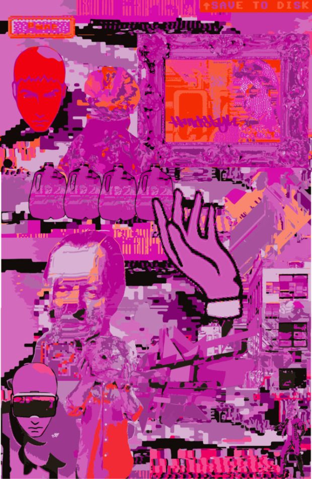
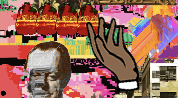
Do you like what you see above? Great, I thought so! Now, below you will see how things can be expanded upon further. The images below are full page screen shots taken with “GoFullPage” which is a free google chrome web browser extension that allows one to, well, get a full page screen shot. You can save the screen shot as a .PNG or a .PDF file. I began doing this with my mmm.page creations and then opening them in Adobe Illustrator to live trace them into vector files (I know, fancy fancy). As you know, vectors are scalable, you can make them and use them as small or as big as you wish, and they print really well too. So, mmm.page became both a creation and teaching tool as well as a catalyst to push things further. And of course adobe illustrator allows for infinite recoloring potentials.. Perhaps these pieces below will become 1/1 edition NFTs? Hmmm, lets see.. In the meantime, scroll below. PS – I may re-use these as background image settings for my next mmm.page creation. (fist bump)

More to come!


Studio Musings & the Digital Versus the Analog!

Studio Musings & the Digital Versus the Analog – 2021, Studio Shot

Tensions are running high here at the Brooklyn studio again.. Im torn between the analog and digital, the “next new” and the “past nostalgia”! They say; “Reflect, Reflect You Must” and we do, and we default to the voice of Yoda, gladly, but then again, we must transcend, and we must go forward, we must go meta-forward! 

These are a few current experiments above and below, they are living together, side by side, getting to see each other’s perspective. They need each other, very much.

Change can happen faster when we face our own metaphors, I like the vulnerability!


Linear Expansions, A Continuum of Line & Form

“Linear Expansions, A Continuum of Line & Form”, 2021, Work in Progress, A Cut Paper Wall Relief.

Im excited to share the progress and process of this new series of paper cut-outs. The forms are arranged directly onto the brick wall in my studio and live there as the piece builds a little more each day. 

Everything starts out as a drawing in my world.. mostly. I suppose thats because its where I got started with art making. Above, we see just a series of smooth and gestural intuitive lines. Im always both surprised and excited by the infinite outcome of what the lines will do. I never draw the exact same character twice. There is always another iteration to explore and become surprised by. The paper cut out at the top of this post is in progress and has thoroughly been inspired by this series of drawings created last week. I cut them out and arranged them on my wall to create a “narrative”. This also serves as an example for my Illustration & Design students this semester. I hope they like it!


The drawings above are a result of this process in the video above. I finally started sharing some of these videos on social media… These kinds of drawings happen in immediacy. Fast, intuitive lines that form each character. They are all different yet unified by their stylized lines. But why stop there, I began to think about process and creating gauge and layers. What happens if I cut some of these forms out? And so it went..

It all starts out like this. Start to extract the drawing by flattening it into fragments. Im using a think bristol paper as my paper source. (Strathmore) the surface is smooth a durable. But alas, it is paper and paper is temperature sensitive, so over time it does buckle and curl. I find that this actually helps though, see the process below

(Sorry for the blurry pict above -Ill reshoot this!) I then lay out a flat variation of my cut out forms in layers, very much as one would use layers when using adobe photoshop or illustrator. This is the analog version, and it is a lot of fun to do. The application onto a flat surface is next. Im working kind of large on this piece to see how the scale holds up, I will make a few small pieces too. 

Here is the first character that was applied to the wall. The forms are adhered to the wall using several loops of thick gorilla brand duct tape. The duct tape works well because it can be “stacked” and it is strong enough to hold the weight of the paper as I layer it. Keep this in mind as the further that your pieces layer and come off of the surface of the wall, they may begin to show the effects of gravity :)) – the process continues!

Process – Here is the progress with the second character created and applied to the wall.

Here you can see the beginning of the third character as well as the reference drawings before they were moved to make room for the next characters.

I work a little bit each day. I enjoy the process so much so I tend to work slow to savor the journey. I also enjoy sitting back and looking at the piece as it grows as it gives me a lot of new ideas. Of course, the next adventure will be to make the characters free standing and able to support themselves in the round. 3D is inevitable both as a physical sculpture and a 3D model in a digital space. 

As of today, 2/17/21 this is where Im at in terms of progress. Should I add more smaller pieces and fragments as scale contrasting details? What am I missing? Lets hear some feedback!

Note – YES, I plan to work in this style with other more permanent materials. I would love to see a series of these placed into public space, would be sweet to see a series inside the nyc subway stations 🙂

Metaphoric Tactical Displacements

Special Ops agents find themselves displaced into an art gallery

“Metaphoric Tactical Displacements”, 2020, Digital Illustration

Two 3D generated figures dressed in special ops / tactical gear are placed into an art gallery. The viewer of the image is provoked to ponder what the circumstances are that brought together this “situation?” The frame is in mid-sequence appearing to be paused from its motion as we observe a seemingly ceaselessness of the characters. The art work on the wall is subjective, yet colorful, energetic and benevolent. It appears to be resembling a character from an animated film or a video game. It is familiar yet not completely objective. Is it the art work itself that is displaced in this image? Or is the image as a whole a representation or a reflection of something much closer to present day reality?

Add your response below.

2020 – 2021- NET-ART OPEN-CALL for Submissions!

Its that time Again!

The NET-ART OPEN-CALL for Submissions continues this semester!

FALL / SPRING 2020 – 2021 Edition

What does this mean? What is NET-ART on the Commons?

The NET-ART 2020 – 2021 academic calendar is now accepting submissions on a rolling proposal basis in the following criteria:

  1. Electronic Media / Experimental Pedagogy
  2. Animated GIFS
  3. Digital Art
  4. VIDEO ART / Experimental Film
  5. NET-ART (Works created in and displayed in a web browser)
  6. Class / Course Collaboration
  7. Digital & Analog ZINEs
  8. Curatorial (A Curated Group Exhibition)
  9. Solo Exhibition
  10. Related “Otherness” pitched to us

Looking for useful tools, apps & tutorials to get your submission started? CLICK HERE!

Looking for examples of “what” has been submitted previously? Explore here!

The NET-ART Submission Guidelines:

Submissions may be generated by CUNY faculty, students of all levels, alumni & community members. CUNY classes/courses may also submit collaborative proposals as a group. CUNY faculty & students may also collaborate with others from outside of CUNY as well.

All submitted works will be featured and published as individual blog posts as well as added to existing galleries on the NET-ART website.

Depending on the submission’s proposal, relevant and in context, various submissions will be published and exhibited as an individual page created specifically for the project.

All submissions should be described in written detail with a clear vision, context and meaning. Supporting images and links should be provided as well.

Authors of the submissions and their collaborators must be willing to participate, respond to comments and expand upon their projects with incoming queries via the commons, twitter and beyond.

The purpose of exhibiting submissions in various categories displays a platform for creative and experimental methods of pedagogy. Please consider how your work will contribute to a larger whole that will be archived for teaching, learning, reference and posterity.

We anticipate your submissions!

Question, Proposals & Submissions can be sent via e-mail or via Twitter to:

[email protected]  /  @ryanseslow 

Paper, Light, Shadow & Storytelling Part 3

Welcome back! Part 3!

Lets make a “free-standing” variation of this project that works “in the round”. 

This post is part 3 of 5 parts from the Paper, Light & Storytelling Project.

*Be sure to read Part 1 first – go HERE

*and don’t miss Part 2 – go Here

*then jump to Part 5 (trust me!) – go HERE

The short video below is a series of snippets taken from various aspects of the project that will help you technically.


Let cut out some pieces, parts, shapes and fragments to compose with. Yes, they are “planes” again, but rather than working on the wall in a relief format, lets create a free standing composition that functions on table surface. As you can see in the video above, leave space at the base of each form so that you can bend and curl it over to create a right angle. This angle will allow for the piece(s) to free stand as you glue them down.


If you follow my examples above and below, notice that “spacial distance” plays a role in how the pieces create entrance ways for light and shadow to play a role. Working with forms that are cut in various heights and widths will also play a role in the overall visual aesthetic.


Below, you can see an example of how you can create “an environment” for your piece to exist in. Perhaps this give a bit more context to the design itself? In this case, I have simply created a gallery simulation by adhering 2 pieces of thick paper together and placing an additional piece on the table surface.


A thicker type of paper works best for this, Im using bristol paper above (11″ x 14″ inches) The nice part about this idea is that you can now use the viewfinder of your capturing device to “crop” the forms into the “gallery” as you take photos of the piece as a whole. See below.


Here is the composition of vertical forms glued down onto the surface of the table, and placed into the gallery simulation. The image directly below is a bird’s eye perspective with the natural light in the room hitting the piece. My ambition is to share the space and spaces between each free standing form.


In this example Im using the same light sources from the previous 3 tutorials (links above). Im a big fan of using light sources to create shadows, effects, filters and moods. These flashlight light sources can also layer over each other and create secondary colors. 


a series of colorful flashlights with their lights turned on

The next series of images below are a mixture of my light source set up, process and final outcomes. Please share your feedback and work via URL in the comments section below! Feel free to hack and remix this assignment and its guidelines. 


Applied Art Resistance Hybridization

an abstract digital image of a painting converted to a vector graphic

“Applied Art Resistance Hybridization”

Hmm, this is probably just a working title above, or perhaps just another bout of my applied art making resistance? Or wait, maybe it is not resistance, it is the creative desire to always things more. To always expand and push it beyond what was learned and practiced..

Yesterday, I posted the first image in this gallery below to my Instagram feed, and I wrote this:

“Another new painting – #wip – acrylic & oil on canvas, well 97% of it is… I spent many weeks looking at it and thinking about it. Is it still a #painting once it has been digitally photographed 100 times? Im struggling as you can tell. I have also now placed several digital forms directly onto this digital photograph of a painting, that you may never see in person. I wont be able to stop this you know.. All I can do now is make more paintings that will become digital images that I can use as props to make more digital things. And that is bliss!”

The post itself seemed to trigger the next series of digital enhancements and then degenerating and desecration.. it is good visual sketch of how my process seems to work. Do the digital works hold up alone as individual works? Should I print the vector versions at the same size of the actual painting (36″ X 48″ inches) and hang them next to each other. Good questions to have I feel.

The final result is a sequence of the individual images set as a motion graphic, or simply put, a GIF. I suppose my ambition is to create a metaphor that shows how the process is not ever static. Nothing is static, no matter how much we think we can make something permanent and forever, we cant, well not while we are operating from our earthly bodies, but thats a whole other conversation.